With Intacct’s recent introduction of the Interactive Visual Explorer (IVE), there are now eight distinct system options for reporting and data visualization. Th...
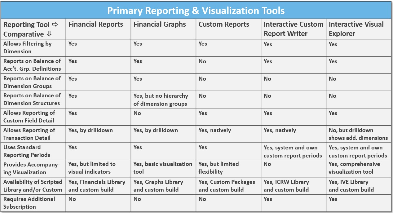
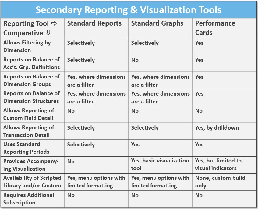
With Intacct’s recent introduction of the Interactive Visual Explorer (IVE), there are now eight distinct system options for reporting and data visualization. Cited in the tables below, we’ve chosen to reference them according to primary and secondary series; the primary series allows for a broader range of reporting options, while the secondary specific to a single reporting outcome. An example from the primary reporting and visualization tool series includes a financial report for the analysis of margin according to comparative periods, customer segment, and item group. The data and resulting format described is more comprehensive than a customer aging report, which falls into the secondary reporting and visualization tool category (limited in data and report output). The purpose of this post is to help you better identify which option is most suitable for your objectives, and some of the trade-offs.
Comparison of System Models
Before considering which Intacct tool is best suited to your reporting objectives for a given situation, we take a step back and discuss the broader topic of system architecture, and how this foundation affects reporting outcomes. To illustrate differing system architecture, the table below captures models from the most unified (A) to the least unified (C), with the comparison segmented according to the maintenance, processing, and reporting of data. That is, for each model where is the data maintained, processed, and reported? From a single or separate system? A “Model A” example includes an organization that uses Intacct exclusively; they maintain all data, processing, and reporting of their data in Intacct, without depending on external data warehouses, processing platforms, or reporting add-ons, such as business intelligence (BI) tools. A company with the characteristics of “Model C” architecture is one which uses Intacct for general ledger and payables, but depends on a data warehouse to manage data from transactions processed from yet another third-party system. They would also utilize an add-on for reporting, or BI needs. Given other factors are equal, organizations choose to move from a unified model to desperate models based on their needs for specialization; that they cannot adequately address the uniqueness of their business needs with the same, or a unified system.

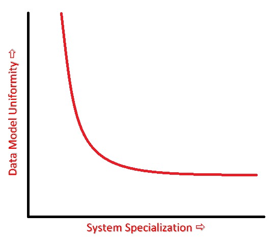
While each organization has differing needs for specialization, and, thus, reason to support separate systems, our review suggests that separating data maintenance from reporting creates additional configuration, prospect for errors, training, and organizational separation. Typically, this occurs as separate systems result in advanced efforts to create a unified/harmonized data model, or simply lose certain details of the data generated by other systems. (At its most basic, data model uniformity means each system maintains the same level of data detail inherent in other integrated systems.) This separate system’s model results in requirements for the mapping of data, integration, and validation, as the hand-off between the data functions is made. Such complications generally result in less robust reporting, with the trade-offs between Models A and C diagramed below.
| A trade-off typically exists between system specialization and data model uniformity. With the introduction of multiple/specialized systems, data models follow -leading to siloed reporting, and/or additional requirements for data harmonization. Alternatively, a single system approach, while delivering less specialized functionality for workflow management, allows users to standardize their data model across a single set of units, dimensions, and transactions. From the range of models above, Model A, for example, generally falls high on the accompanying curve, while Model C, would drop to the lower part of the curve. Given a system relevant to the specialized needs of a company, the highest point on the curve will provide maximum utility. |  |
Our post focuses on the utility of Intacct’s single system model as adequate to the specialized needs of an organization, with the resulting report and syndication options providing maximum utility.
Overview of Intacct Reporting Options
To aid in the selection of the best option for the reporting task at hand we’ve applied a standard comparative to the primary and secondary table series. These comparatives are viewed in the first column, and are intended to help clarify what we’re often frustrated by in our consulting efforts, which report does what? An example from our practice is clarifying which option allows for reference to account groups, dimension groups, and dimension structures. Determining which report(s) reference these basic GL account and dimension building blocks saves time in the process of report writing, and the cause for our clarification. Other common comparatives include whether the report provides a visual representation of the data. While obvious in Financial Graphs, and the new Interactive Visual Explorer, this is less understood when considering Financial and Custom Reports. Additional descriptions, and commentary about the strengths, weaknesses, learning curve, and data source for each of the report options is included.
Primary Reporting & Visualization Tools – Sage Intacct’s premier report and visualization options to address broad and detailed reporting requirements. Based on Intacct’s history of development, and reporting objectives, we further segment this overall series as follows: 1) Financial Reports and Graphs, 2) Custom Reports, 3) Interactive Custom Report Writer (ICRW), and Interactive Visual Explorer (IVE). These groupings help us to further consider the data source/objects that the reports are best suited to present. An additional note is that for certain modules, such as Projects and Contracts, there are very few, or no, report options available from the secondary series. Meaning, reporting and visualizations for these specific modules must come from one of the five primary series options below.

- Financial Reports – The most standard and utilized report option, with presentation based primarily on account group data (groupings of GL accounts). Financial Reports can incorporate dimension groups and structures to allow for segmentation of report data on a vertical, and/or vertical and horizonal basis (vertical report presentation could display items in the first column with their annual sales amounts in the body of the report, where a vertical and horizontal presentation could show items in the first column expanded by the class dimension, which displays annual sales amounts for the items, segmented, for example, by industry, or class). Standard GAAP, management, and financial metrics reports are very likely prepared using Financial Reports, with more formatting options available than other Intacct reports. For reporting specific to record-based or transactional data objects, such as customers, AP bills, or projects, other report options are likely a better venue –especially if the focus of the report is not specific to reporting on these objects in relation to GL account balances. Learning how to format Financial Reports will require training, either from CLA, or Intacct directly.
- Financial Graphs – A legacy visualization tool from Intacct, with presentation, like the Financial Reports, built around account group data. While Financial Graphs incorporate some standard reporting periods, they do not allow for more complex series arrangement, where, for example, you want to show the trailing three months starting from the prior month (only reference point for fixed backwardation is “current” periods). Most users are likely to create Financial Graphs to display a few specific balances in tandem, such as an overlay of cash, AR, and AP. Configuring for the primary and comparative data series in Financial Graphs is kludgy, as selected pairings yield different options, thus negotiating some tradeoffs. With the introduction of the Interactive Visual Explorer (see below), it’s unlikely Intacct will provide further enhancements to this reporting facility. Some benefits of Financial Graphs are its inclusion in the Intacct core subscription, and the relative ease in learning how to format graphs for use in dashboards or exported to a final presentation package.
- Custom Reports – Sometimes called “ad hoc reports,” this facility was Intacct’s first answer to users requiring “mash-ups,” or an option for reporting on records, transactions, attributes (secondary characteristics of a data object), lists, with limited reference to GL account data. Custom Reports provide the broadest set of objects for reporting inquiry, significantly more than ICRW and IVE (see below), with reference to the full report object/primary data source library found here. Our interest in listing the source library came as users struggled with a simple source listing of all objects, and their basic definitions, which we find as one of the weaknesses of Custom Reports. Another challenge is the labyrinth of data attributes available to the user, and the oft-overlap of these as one selects from amongst potentially dozens of related objects. While these factors, and a crude user interface, makes the learning curve steeper, Intacct is committed to updating the report’s object library, and a few formatting upgrades as well. Finally, Custom Reports are part of Intacct’s basic subscription library (no extra subscription cost), with organization’s likely to find repeated use of the report writer for uses outside of financial reports.
- Interactive Custom Report Writer (ICRW) – Consider ICRW like Custom Reports on steroids, and sharing functionality with the Interactive Visual Explorer (IVE) through a common objects list (click here for details) and similarities in the user interface. The brother-sister relationship between ICRW and IVE makes the former the partner in advanced ad hoc numeric reporting, and the latter advanced graphing/visualization. The strengths of ICRW include very detailed report formatting, options for pivot table presentation, and database like control over joining records from two or more distinct tables (for example, the ability to join AR and AP balances into a single report, with reference to locations, entities, or combined with other dimensions, like departments). As previously noted, the object list available in ICRW and IVE is not as comprehensive as the objects list available for Custom Reports, but those that are available are most common to user’s ad hoc report subject matter. As there’s an additional subscription cost for ICRW, companies will need to consider their reporting objectives as insoluble in the base subscription (Financial Reports, Custom Reports), but balanced by support for a single system model which creates significant value. There’s clearly a learning curve for knowledgeable use of ICRW, available from CLA or Intacct.
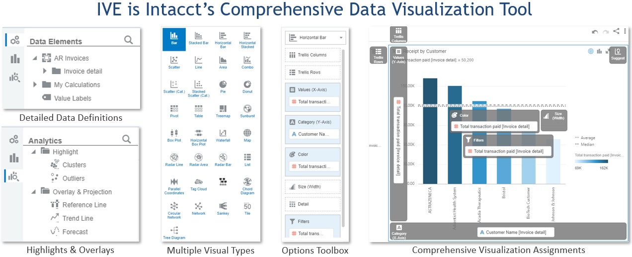
- Interactive Visual Explorer (IVE) – Intacct’s just released (February 2021) comprehensive data visualization tool for analysis of financial position, performance, and trends. As noted, IVE shares a common data objects list and UI with ICRW, but output details are graphic in nature, with additional options for list, table, and pivot reporting. Intended to give Intacct users access to a BI reporting layer, they are able to construct 25 different styles of visualization, including bars, scatter plots, pies, geo maps, radars, treemaps and diagrams, and other tabular formats as noted above. Visualizations can also be enhanced using overlays for trend line, cluster, outlier, and reference lines. The package format is per Visual Boards (similar concept to Excel’s workbook), which are an aggregation of Canvases (think worksheets in Excel), with individual Visualizations within each Canvas. Limitations include a different detail data format than typical to Financial Reports (has its own), and the inability to report on either dimension groups or structures. An additional subscription cost is required for IVE, but, again, use of the tool creates value from adherence to the single system model.

Secondary Reporting & Visualization Tools – A secondary group of reporting and visualization tools gives you opportunity for detailing specific data objects, and their related balances. Most prominent in this group are Standard Reports related to the subsidiary ledger, including AR Aging and Ledger, AP Aging and Ledger, Deferred Revenue, and, of course, the GL Report. Many additional Standard, or sometimes called “canned” reports, are available from the AR, AP, Cash Management, Order Entry, Purchasing, and other modules. Related to many of these reports are Standard Graphs which provide a similar single data object and balance for visual display. Finally, Performance Cards provide a single account group view with comparatives. These secondary options often become a manager’s go-to for specific operational efforts, like collections.

- Standard Reports – For specific account balance detail, history, and limited forecasting, Standard Reports provide users with the fundamental standing of a company’s financial position and performance. With each module sponsoring between 6 – 20 Standard Reports specific to its functional uses, users will find that filtering and format options are reasonably good, and that Intacct has worked to improve their functionality over the years. Difficulty in replicating the format of these reports using other Intacct options, and holding subscription costs to a minimum, keep these as part of the core report library of any organization. There is no accompanying visualization for Standard Reports, though related Standard Graphs (see below) meets this requirement. Training for these reports is minimal, and generally only requires patience to improve formatting, or a specific filtered view(s).
- Standard Graphs – Frequently overlooked for their reporting functionality, Standard Graphs, give users an accompanying graphical view of specific account balances reported through Standard Reports. While the AR, AP, and Order Entry modules have specific menu options for Standard Graphs, like the AR Invoice Analysis graph, some of the graphing options/capabilities are imbedded in their related Standard Reports (example includes the Projects module Project Financial Summary report). We’ve found certain of these reports, such as the AR Invoice Analysis Graph, to provide excellent utility in outputting simple comparatives of customer revenues filtered by the top N accounts. Similar to Standard Reports, use is straight forward, with minimal training involved.
- Performance Cards – Used to provide “in your face” account balance updates, and comparatives to those balances, Performance Cards are typically placed atop a dashboard for quick reference, and, hopefully, management action, if required. Similar to Financial Reports and Graphs, Performance Cards report on account group balances, and sponsor visual indicators (icons) which indicate either positive, or negative variance. The value of using account group balances as the underlying data source is consistency to the same groupings used in Financial Reports and Graphs, and in the ability to display basic ratio metrics using computational account groups. Training is minimal, with Performance Cards part of the core Intacct subscription bundle.
Libraries, Packages & Syndication
We conclude our post with a few remarks on access to reports and visualizations, and their syndication. In the primary and secondary tables listed above a comparative of the availability of scripted libraries and/or custom builds is shown. Noted is that for each of the primary report series both a scripted (templated or canned version), and custom build (built from scratch or on your own) option is available. Libraries are available by clicking the [Library] (button) (upper right hand corner) of each main report option, while Custom Packages for the Custom Reports are available as follows: Company Module > <Admin> (sub-tab) > Subscriptions (link) > <Custom Package> (sub-tab) > Toggle On for any Custom Report Package required. For the secondary report series, the scripted libraries are inherent to each module’s standard/canned reports; that is, they’re prebuilt and available from their respective “Reports” menu, thus, they don’t need to be downloaded or built (exception is Performance Cards, which are custom build only).
There are a few options for the syndication of reports, which follow a “pull” or “push” methodology. For use with either method, Intacct offers multiple report segmentation options, including by entity, dimension, dimension ownership (a subgroup of a dimension), user group, user, report type, and report audience. This means, that, if required, report access, or distribution of a report(s), can be limited to only those designated in an applicable segment. Given applicable designation, on “pull,” means a user needs to login to the system to either query a report(s), or access a dashboard, where on “push,” means a user is emailed a report or series of reports. Dashboards allow for the highest level of report concentration, by aggregating any of the eight distinct system options for reporting and data visualization discussed. They also prove the value of Intacct’s approach by real time view of all data processed, maintained, and reported through a single system.
The post Expand Your Reporting Horizons appeared first on Sage Blog.
